These sandals have seen some hammer… Just back from an Italian adventure pounding the city streets of Florence and Rome, the sandy beaches of the Cinque Terre and the Island of Ischia… Beautiful, beautiful sights and sounds and smells….
Heat and paint and stone
But before i kicked up them heels i had my favourite Art Trail yet (although I say that every year!) Here are some pics of the stuff I had on show over the weekend.
Brother Duncan exhibited at mine this year too and we had a grand time (he’s good company) (and stunning craftsmanship)(and he ate a lot of cake!)
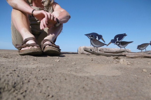
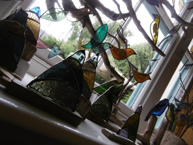
Lots of birds..(well they are my favourites)(new and old)
and other stuff too… works in progress… commissions… and a riot of colour in the front window.
I am now busy working on orders and commissions but, you can still get to see some bits of my work by calling in to Debbie’s Shed of course. Or visiting the Pier Lane Gallery and Gallery H in Arnside; Northern Lights in Keswick; Brantwood near Coniston; and Witherslack Community Shop for the month of August.
These wee things are going to Pier Lane next week….
And this goes to its new owner tomorrow (Congratulations!)
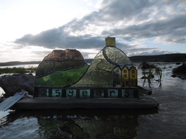
A special 25th Wedding Anniversary commission featuring special places… Sirling Castle, Rivington Pike, Arnside prom’… and of course, the beloved bikers.
‘Are you sure you don’t just want a number five’ I asked, of Penny and Tom, my ultra-enduro-ironman-BG holding friends…
‘No way,’ they said!
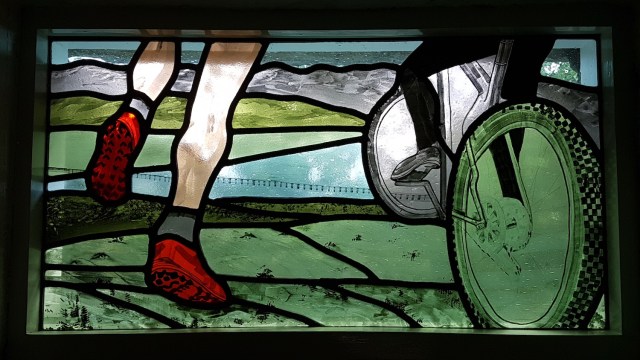
Ha-ha, so, the only five in their panel is the pair of size five fell shoes that are leaping off the Knott..
‘Something that reflects us’, they said, ‘and where we live….’
(A friend of theirs visited from the south this week and he found their house from the stained glass panel. Hee-hee, he knows them well)
So, here is what I gave them…
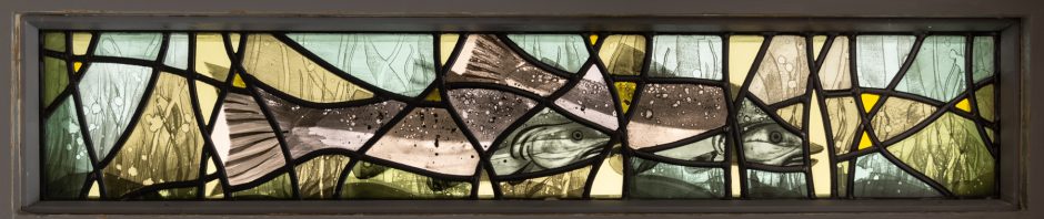
The panel is a fanlight above their front door measuring 740mm wide x 390mm deep.
Drawing first… I wanted to capture movement and a sense of the place… (the viaduct helps with that!) And Penny and Tom’s beloved Cumbrian hills to the north.
Then cut glass… apply paint….. build up layers and details…
Fire and fire again for depth of colour.
Relaxing leadwork, soldering and grout.
Then polish and polish till it gleams. (I make it sound so easy don’t I. Trust me, it is dead tricky!)
The brief (in brief) was to come up with a piece of artwork inspired by words, be it a piece of literature, a poem or even song lyrics. And oh my, this sounded good to me.
I pondered and bounced a few ideas around and then it came to me, one sleepless night, brain churning and whirring with thoughts and ideas…..
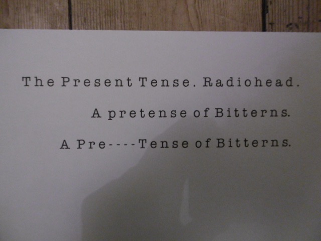
For Christmas I had received a copy of Bill Bailiey’s Guide to Birding… a very entertaining account of his 100 favourite British birds splattered with his funny tales, illustrations and anecdotes. And one phrase had stuck. Wedged in a part of my brain was ‘pretence’ being the collective noun for a group of Bitterns. Upon reading it it had immediately conjured up images with me, of camouflaged bitterns pretending they were reeds!…. Something to think on, i had paused to think at the time….
And now. Now. Worming away in my head was an earworm by Radiohead. An hypnotic repetitive tune that makes me stop and dance around my shed whenever it is aired on 6 music. ‘In you I’m lost, In you I’m lo-o-ost’ being whistled and hummed constantly by myself as I cheerfully go about my business….
And then. On that sleepless night the two ideas crashed together and the germ of an idea was born. A doodle was drawn and bounced around friends… And, oh. The idea? … Here you go.
Now, if you don’t know the song, inside out and back to front, like myself, then I would suggest you pause and go take a listen. You can find a really terrific live version on youtube. I am sorry I can’t add a link here as I have a budget blog(!) but I am incredibly happy with it and Youtube is very easy to navigate to in any case…. so off you go. (Open a new tab and play…play whilst looking at these pics…)
So first, I drew up my pair of Bitterns. I decided to go reasonably big as I like my subjects to feel real and have scale. Then I copied and slid the images around. No fancy photoshop…just scissors and a pritt stick…. This sliding around and distortion from the song ‘keep it moving’.
And then the tragic part of the song when the world comes crashing down. I slashed the piece horizontally this time with fractures that respond to that repetitive hook of the melody that repeats and repeats endlessly throughout the song.
In you I’m lost. In you I’m lost. repeat, repeat…repeat.. repeat….
And so it works on paper but ….can I make it work in glass?
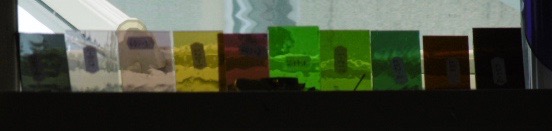
I settled on a simple palette of four colours, 2 yellow, 2 grey and set-to testing up some samples. Here is where I am at..
I do love this experimenting with paint. And I think I am nearly there… But for now I submit my ideas to the ‘Telling in Full’ submission panel and see if my piece will make it to the exhibition.
I should know soooooooon. (But hey, I’ll make it anyway. I’m sure.)
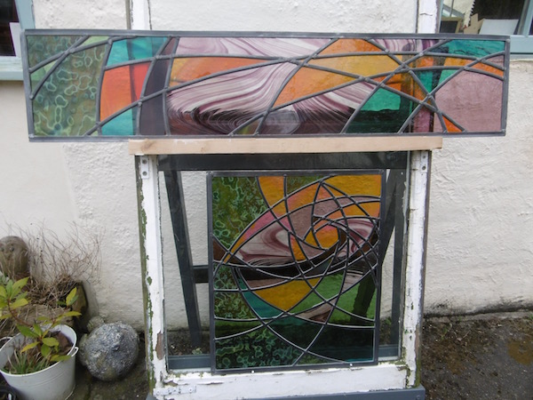
The Finished piece will be constructed using traditional stained glass methods. Painted sections of glass joined by leadwork to unpainted sections of glass… playfully and gleefully distorting the light and imagery.
So this is where the design ended up. (Not as easy as it looks this abstract stuff)
You wanna’ see how I got here?…
My initial designs were a little ‘tight’. Too curvy.
So I scrawled some words… edgy ….free….spiky… loose…. And with the help of some good tunes I loosened up and ended up with curves I was happy with.
Projecting the lines to get the top light was fun… a wee scale drawing exploding upwards and onwards and I found my star (you spot it in those intersecting lines?)
So, now to add colour…… Tracey and John knew what they liked..
We had spent an overwhelming day in the Summer at Pearsons Glass in Liverpool. And came home with a psychedelic rainbow!
My ‘glass easel’ came in handy once again for colour checks. (Few head banging moments I tell you). And many bits cut and re-cut to get the arrangement and colour combination just so.
Oh dear. Not liking that milky heavy cream streaky. Without the light it looked fine. But with the light. Oh No. We can’t have that… back to the cutting block…. rearrange the grounded bits.. add more of the orange..
Now we are getting somewhere….
Happy. Construction can begin…..
And then the fitting….. great being an apprentice with John and handing him chisel…putty….scalpel…coffee!!
This project started way back in the Summer… ages ago. A collaboration with my stained glass friend Peter. A design and painting project that Peter thought I might quite like.
Foxgloves he said, and perhaps a wall.
Do they have wings? said I.
Haha…crack on he said, you can do it.
The client said yes to my initial doodle whilst I inwardly quaked at the sizes Peter had quoted me! (thinking, I’m going to need a considerably bigger bench!)
I sketched things bigger and we visited site and when the sheet was pinned to the walls of the clients kitchen, she said yes, yes, yes.
(Darn it – I’m going to have to see this through then).
The site visit and meet with the client was great. Now I had a feel for the location and orientation; the colour of the stone; the architecture of the building and a rough idea of likes and dislikes.
(Oh yeah, good to go now!!)
(How I overcome my fear of that huge sheet of paper?)
A friend was helpful. Take a look at Georgia O Keefe, he said, think about your lines and shapes and let the detail come later.
So. Fortunately, I was able to ponder and draw and redraw lines over a good length of time. I studied undergrowth. I looked closely at foxgloves. I stacked up wee chips of coloured glass in my window and so settled on a palette.
With lines refined and glass delivered I was ready to start cutting.
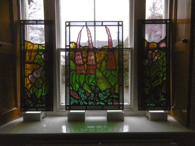
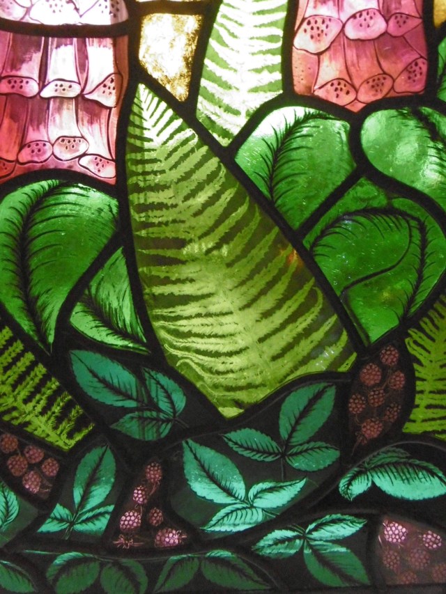
This project was in fact three windows. A front door panel measuring 760W x 1065D and two sidelights measuring 400w x 1065d for an entrance in a new build house – the house being named Foxglove. The two neighboring houses, which the client had also built, were called Briar Rose and Thistledown – beautiful, said I, how about I use those blooms in the two side panels. And so that was agreed.
And I planned rambling brambles to scramble along the bottom of each.
So, when I started to cut I was happy to start on one of the smaller(!!) side panels (still the biggest thing I had ever done). So Briar Rose I chose to start on.
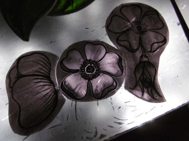
I built up the detail using layers of paint. And so the start of many, many late nights on the light box with Gideon Coe on 6 for company – happy days. Matting, scraping, scrubbing, painting and splattering until I was satisfied.
Then fire in my kiln. There were a few mistakes (aren’t there always!). The red I had selected for blackberries was too harsh so I swapped in an easier on the eye purple. Re-fire and yes, I was happy.
Next the foxgloves. Initially I used the same pink as for the roses but somehow it was too tame. I returned to that gorgeous piece of handmade pink-gold from EAG that I have been hording and stroking for ages. Perhaps its moment had arrived!
I painted two sets of samples and surprise, surprise, went for the none tame option. Beautiful, beautiful shocking pink foxgloves – a bold centerpiece statement.
The prickly thistles was the panel I was really looking forward to though. How to make some bits look untouchable and other bits light as, well, thistledown. Careful matting, scrubbing, re-matting and line that how.
Have I said I loved, really loved, painting these panels. It was so all-absorbing. Challenging and experimental and the steepest learning curve I have been on a for a while, (and, well, I do like steep hills!).
So all-fired, (some re-fired) (some clumsy breaks – doh) but then ready for leading.
I was delighted when Peter said he was happy for me to do the build. I would have been reluctant to part with all my pieces at this stage. And so, the bench extension (or elevation, in actual fact). A visit to TP’s and I built a new staged top to sit atop my trestle. Hey, it is now the perfect height. Why did I not do this years ago!
I asked advice from my friend at Pendle Stained Glass with regards strengthening and he suggested steels in the border and 8mm lead throughout. (That took some stretching I can tell you!) But it was great. The 8mm lead added strength and strong line to panels of this size. Perfect.
Leadwork. So satisfying. Thinking about which lines to flow through and where to put the joints. The don the mask and do the soldering. Nerve racking flipping these panels to solder the underside, I tell you.
Finally, the last stage, grouting and polishing. I invested in a new bristle brush (far too big a job for using fingers!) and slopped it on. Pushed it into gaps, dusted on the whiting, flipped and repeated – for all three panels. I left to firm up before scraping off the excess and polishing and polishing, and just for good measure – more polishing. A physical part of the job – tired shoulders and embarrassing fingernails.
And now they have gone. Off to the double glazers with Peter to get encapsulated into double glazed units. But not before I braved propping them in my front window and snapping a few pics.
Have just updated my events….busy busy time approaching.
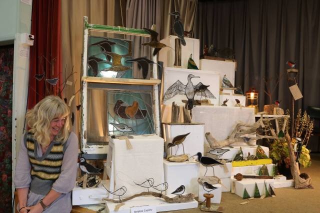
Just taken part in a group show with members from the Silverdale and Arnside Art and Craft Trail, Art Trail Autumn took place at the E.I. in Arnside.
Here are a few pics of my stall.
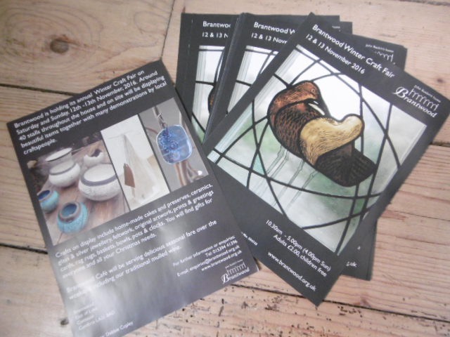
And if you missed me you can catch me again at Brantwood in a couple of weeks. (I am so lucky – I have winged it on to their flyer!!). 12th and 13th November 10:30 – 5:00pm.
Following that is my favourite wee night time Craft Fair in the Gaskell Hall at Silverdale. (Saturday 26th November. I hope to get some angels made by then!!)(Concentrating on Robin’s at the mo’).
And then Saturday the 10th is my final fair at the Story Institute in Lancaster. This was great last year – a huge variety of stalls. Great to finish off your Christmas Shopping there.
You can of course drop by Debbie’s Shed at any point – but best to check first that I am in. (I should be…it is head down with work work work at the mo’)
Mulled wine will be on offer on the last Friday of the month…that would be Friday the 25th November…stick the date in your diary!
A special commission for a very special charity in memory of a very special boy named Reuben.
Reuben’s Retreat provides respite care to relieve the distress of families and their close friends who have suffered the bereavement of a child or have a child suffering from a life limiting or life threatening illness.
Emma wanted a commemorative piece of artwork for her friend and founder of Reuben’s Retreat. So working with their existing logo and symbols, ‘Reubow’ was born.
Here is how it developed….drawings first….and fiddly diddly fun construction!
The springy-flower and buzzy bee were constructed using recycled pottery and glass in a copper foil technique. And the main pretty coloured panel utilised a mosaic applique technique with some decorative carefully chosen pottery bits too.
All mounted on a grand bit of driftwood!
(I also heard that they had a bit of a thing about Robin’s too so I gifted one their way to help make their gardens look even nicer. x)